Today we’re pleased to announce the launch of a series of major updates for RapidSpike! The changes include:
- A complete overhaul to our app navigation
- A new section – TV Mode – a live status page for your servers and devices
- Replacing the old Dashboard with a new Home Screen
- Our new In-app Messaging Centre
- Adding Google Auth integration so you can attach you Google Analytics account to a website
We’ll cover some of these in another post – so for now we’re just going to talk about the first three – the new navigation, TV mode and changes to the dashboard.
Redesigning RapidSpike
Since the very first Prototype for RapidSpike we’ve been deeply concerned about making sure our app is as easy to use as possible. No web-app or tool can ever truly gain traction whilst being awkward and irritating to navigate – users sign in for the first time, play for a while and then leave – never to return.
We’ve worked really hard over the past year to try and keep our menus self-explanatory and helpful. However as we’ve layered in new features and services we’ve felt that the UI needed improvement in a number of important ways:
Design Space
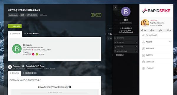
As of last month we’d reached the point where a lot of the design space of the app was taken up with menus. When viewing a website the menus fill nearly 40% of the screen, limiting the space available for the important stuff: graphs and data for your monitors.
Confusing Navigation
During the Beta some users reported confusion over how RapidSpike organises data. To help solve this when we launched in October we added extra navigation aids to the design – breadcrumbs, headings and so on. However this had the opposite impact, causing more confusion about where to go and what to click on. We needed a way to visually show how we group monitors.
Some suggested that our current Dashboard shows how we group data reasonably well – each “asset” can be opened to show Pings, TCPs and websites. We started to think about designing a new menu in a similar style.
Improving the Dashboard
Over the last few months we’ve also had a number of requests for some general improvements to our Dashboard. These included adding or changing the data shown to give more insight into the monitors in your account. Users with lots of servers/devices to monitor asked for pagination and sorted to help manage them.
Rather than tackle these issues separately, I decided to resolve them together with one significant change:
- Remove all sidebars and put the main navigation at the top of the app, in a pop-up overlay.
- Greatly reduce the number of nav elements, streamlining the process and making it easy to ‘learn’ how to use the app.
- Incorporate a newly designed ‘dashboard’ style view into the menu so users can see how their monitors are related to one another. Improve this dashboard so it displays more useful data and can be reorganised and filtered.
The results
We’ve moved all navigation into a slim header bar – this contains:
RapidSpike Menu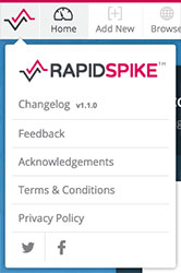
Click the RapidSpike icon to open this menu.
Here’s where we’ve put links to some important out-of-the-way pages such as our Changelog, T&Cs, privacy policies and social network accounts. You can also open our Feedback form to send us messages, ask questions about the service and so on.
Main Menu – Browse
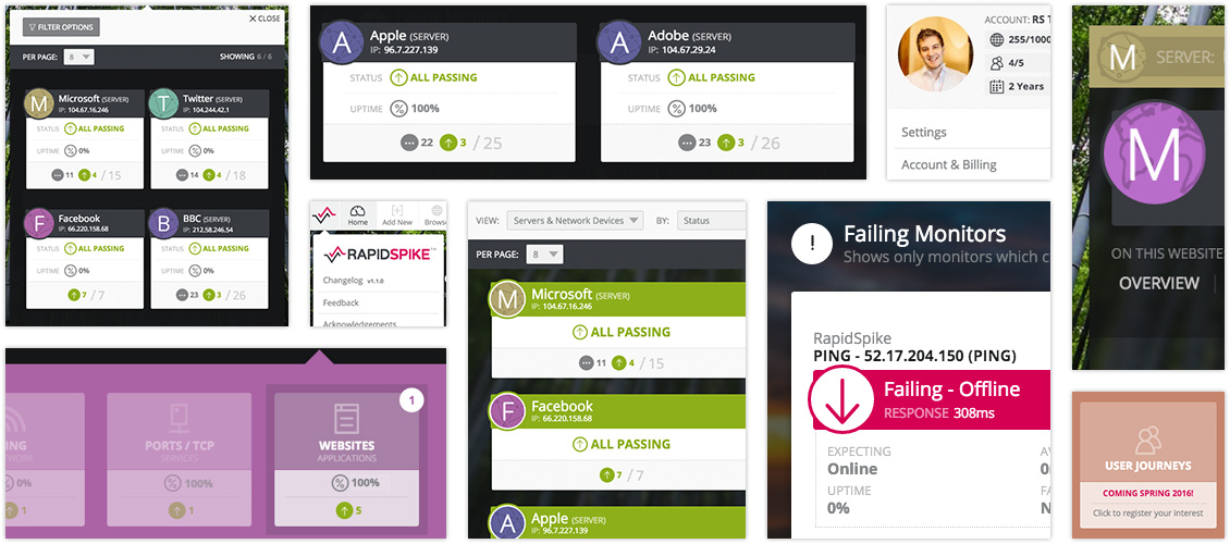
The main navigation item is called “Browse”. It can be opened from any page on the app and shows your servers/devices listed by a number of different metrics – monitor count, uptime % and status. We’ve also added paging if you have a lot of servers to manage.
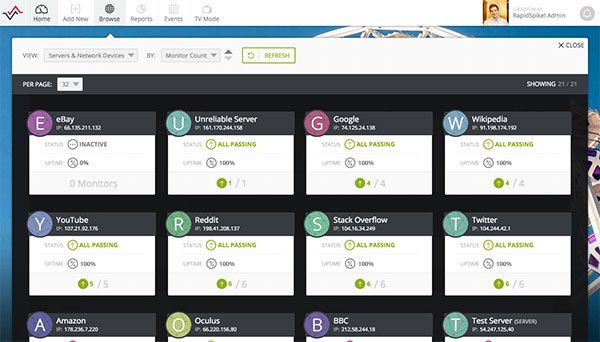
Click on a server to open it and see the sub-pages available. Click on each of these to visit that page.
If the server hosts one or more websites, you’ll see a “Websites” option that can be opened to show the sites on that server. Opening a site shows its sub-pages.
It’s a simple as that! We’ve colour-coded everything to make it clear what you’re looking at. Navigating to a new server just closes the open panels and opens a new one for the new server. This is now the primary way to navigate between screens of the app; we hope you’ll find it clearer and much easier than the old menus.
Main Menu – What else is new?
Also in the main menu you’ll find the Add New, Home screen, Events, Reports and TV Mode links.
The new Home screen shows a simple summary of your account and any failing monitors currently on your account – with some quick links to take you straight to the page where the monitor can be found. This data auto-refreshes every minute so you can be confident you’re on top of any problems. We’ve got some big plans for the future of this page and we’re excited to share them with you soon!
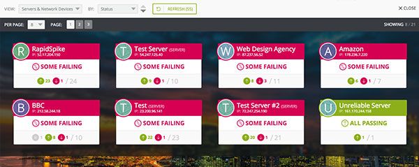
TV Mode is a new status screen that shows all your current servers & devices and their status. It’s designed to be shown on a wall-mounted TV or large-format monitor and can be viewed from a distance. We’ve made the display a bit chunkier and more colourful and – best of all – it refreshes automatically every minute.
My Account
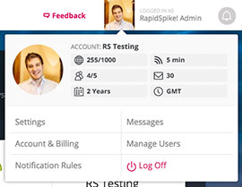
The My Account menu can be reached by clicking on your name or avatar.
Here we’ve put links to everything related to your account: settings, users, notification rules, and so on. This has made it much easier to reach some really important pages (such as “Notification Rules”) which previously were buried on other pages.
We’ve also added a few vital stats on your account usage – how many credits you have left, monitors you’ve added and so on.
The Messages Centre can be reached by clicking on the bell in the top right – here we’ve stored all messages you get from RapidSpike: alerts, system emails, announcements and so on.
Overall we’re really pleased with the improvements to RapidSpike and we encourage you to go and check them out! We hope you’ll find managing your account much easier in future. As ever, please use the ‘Feedback’ buttons to send us your input. Log in to your account here.
