A new version of RapidSpike is due to be released in the next few days. Here’s what’s changed, and what’s new:
Menus
It may look like everything has changed – but never fear! All we’ve done is move the old menu bar from the top of the screen to down the left. We’ve also made it blue.
There’s actually a stack of reasons for making these changes, but we won’t bore you with the specifics. Put simply, we feel the navigation makes more sense when we organise it flowing from the left to the right. Like reading a book.
You won’t need to look all around the interface to find where to go next – it should be clear as you move from the top level to interior pages.
To reach key dashboards within RapidSpike, you’ll always follow the same direction. First, you interact with the blue main menu on the far left. Then you’ll see the grey sidebar menu where you can access sub-pages. Finally, the content and data you need appears in the main window.
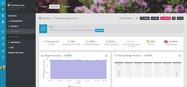
To make things even clearer, we’ve made it so parts of the app will darken when you open menus. This should help focus your attention where it counts.
For mobile users, the app won’t have changed much. The interface scales depending on window size so you should get a comfortable experience regardless of what you’re using.
You might notice that the “Navigate” button has gone. Instead we have three options:
- View Websites
- View Servers
- View by Monitor Type
This is actually the same old “Navigate” window, just split into three. We felt it was important to make it really clear where to go if you just want to look at a website.
The “View by Monitor Type” option will display lots of different kinds of monitors in your account, so you can get straight to them. We’ve added WHOIS Domain and SSL Monitor types here, but the plan in future is to include most, if not all, the monitors we offer.
Dashboard
The main “Home” screen dashboard has a key new widget. It’s one we’re really keen for everyone to use. We’ve called it “Website Status”. It’s available to add by clicking “Add Widget” at the top of the page.
Website Status loads all the sites on your account and presents them in a clean and simple format. It then loads some key monitors. It will reorganise the websites to put your favourites at the top (see below for an explanation of ‘favourites’). Finally, it’ll put any sites with “issues” at the very top and colour them in pink.
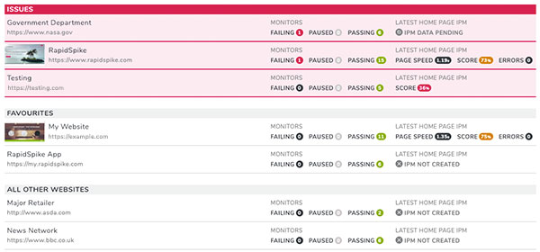
We have a few criteria for what an “issue” is; firstly whether or not a failing monitor is found. Secondly if you have an Intelligent Page Monitor running, we check the latest IPM to see if any errors were found. Finally, we check Google Audit score to see if you’re above 50%.
We’ll be adding new criteria soon, so you can be sure sites flagged with issues need your attention!
Shortcuts
Shortcuts are a really useful tool in RapidSpike. They let you flag certain servers, journeys websites and sub-pages as a “favourite” that you can jump to quickly.
Shortcuts haven’t changed: we’ve simply renamed them to “Favourites”. They will also feature in the new Dashboard widget. If you have any sites flagged as a Favourite, it’ll appear at the top.
Flag a page as a favourite simply by clicking the blue star icon next to its name at the top of the dark grey menu. You can also add new favourites by visiting the favourites section, found under “Config”.
Hopefully you’ll find these changes make using RapidSpike even easier than ever. You might notice other, smaller updates throughout the app as we continue to improve the design and functionality of the app.
Please do let us know if you have any feedback via support@rapidspike.com.
