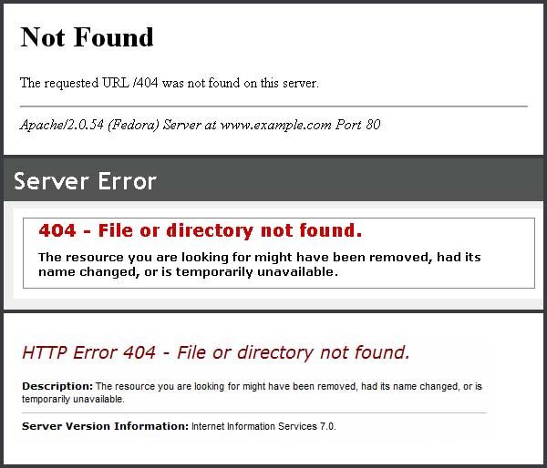
When you add a new website to your RapidSpike uptime monitoring we automatically check for the existence of a default 404 page, making sure the page exists and that the server is returning the correct status code:
But why?
We all know that when a page doesn’t exist on a website you should end up on a 404 page. This is simply the page that is displayed when the server cannot find what you are looking for. Historically, 404’s were viewed as a disaster – but they needn’t be. They could even be turned to your advantage.
So what are the common causes of a 404? Well, it could be down to a number of reasons:
- Human error – a mistyped URL
- An old link to a page that no longer exists
- An outdated link in an email
- The page has accidentally been removed
- An error has caused the page’s path to change
Clearly this is a situation we would ideally like to avoid as it instills doubt in the customer’s mind and sets a negative customer experience.
Avoiding negative experiences
We all want our websites to run perfectly 100% of the time, with no errors or missing pages. However at the end of the day we are all human and we can’t get everything right all of the time. So, if you accept that errors will happen it is really important that you plan for the eventuality and ensure that you have a professional default 404 page.
If no page is set the customer sees whatever default the server spits out, which is ugly, unbranded and often less than helpful:
RapidSpike checks for the existence of a default 404 when it initially scans a website but you would be surprised how many times we can’t find one. It probably existed at some point but through the mists of time it was either lost or forgotten about.
So if it is going to happen then let’s turn a 404 into a positive experience. Rather than focus on the negatives it might be an opportunity to have some fun and turn the error to your advantage.
A better 404
When doing some research for this blog post I came across this article which has some really great examples of 404 pages:
http://www.creativebloq.com/web-design/best-404-pages-812505
I lifted this comment from the blog:
When done really well, 404’s can become mini-ambassadors for the website itself, being shared on Twitter and blogs as an example of the site or service’s keenness.
Elegantly put and I totally agree! The 404 can become so much more and needn’t be such a negative event. I had a look around the internet for a good 404 page to talk about and I came across this great example, below:
It’s funny, looks professional and has clearly been thought through. It also cleverly and subtly reinforces the business message –
But if you are more interested in personal finance than Justin, try the links below…
The customer is probably smiling, still knows where he or she is, has clear navigation to carry on and is reminded of the sites purpose at the same time – job done!
So remember,
- The 404 is an opportunity to look professional and reenforce the business message
- The customer needs to know where they are and how to get back to the main site
- The page has to be on brand and designed as an integral part of the site
- It must have obvious and clear navigational options maybe even a sitemap to help customers navigate back to where they need to be
- Maybe provide the option to leave feedback as it might not be a page you are aware of
- Have a bit of fun, people like to smile 🙂
At RapidSpike, we see the 404 as a fundamental check and an opportunity which is why we check for its existence. I hope this blog has been thought provoking. How good is your 404? Does it make you smile? And – will it leave the reader feeling good about your business?


